Community Publishing
⟡ Highlight skillsets
A bit about client
Short Édition, a small but visionary French publishing house, arrived in the U.S. with a big idea: to ignite a passion for storytelling by making short stories accessible to everyone.
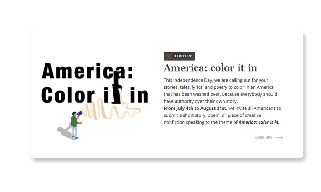
Imagine this: Short Édition is setting up its first U.S. office in Philadelphia in January 2020. They've introduced their innovative short story dispensers, which dispense stories on demand, and are set to launch their first writing contest in the U.S. The contest would go live on the most American of holidays, July 4th, with the theme America: Color it In.
I was asked to lead the creative charge, to capture in a single image everything this contest stood for: diversity, voice, and the vast, untold stories of America. And, as is often the case with projects that matter, the deadline was tight. We had just short time to take this idea from concept to completion.
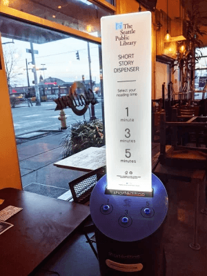
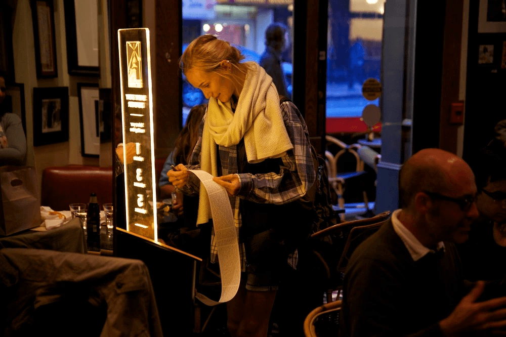
📸 Read thousands of short stories and poems across various genres, including humor, sci-fi, and magical realism from this dispenser. It's free to read. Source: Short Édition
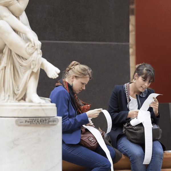
📸 Images of people reading the stories from Short Édition. Source:Short Édition
Understanding the message
My approach
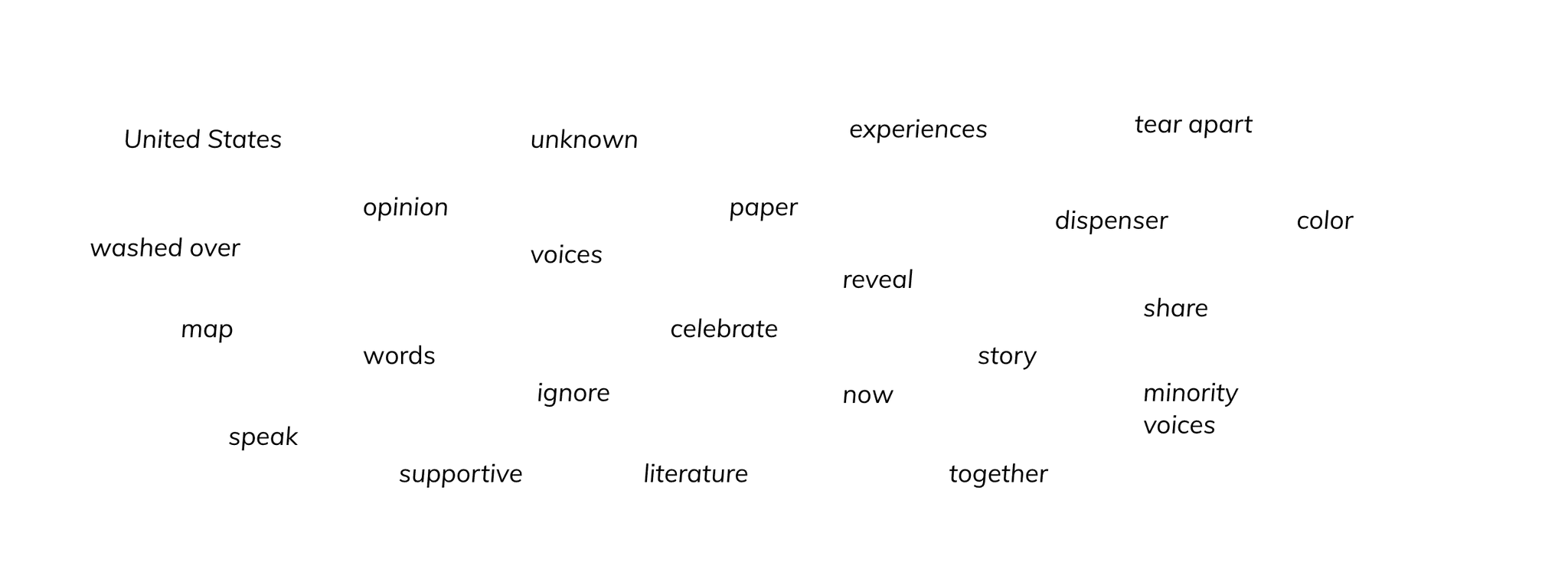
When I joined the project, the first step was to brainstorm and distill the core message with Short Édition's editorial team. I collaborated closely with Lana Proctor, one of the most amazing editors I ever worked with, to define what the visual design needed to do: draw people in, make them think, and make them feel invited to share their America.
We didn’t want to lean on traditional patriotic imagery, no waving flags or standard red, white, and blue tropes 🇺🇸. Instead, we wanted the concept of "coloring in" to come through in a literal and metaphorical way.
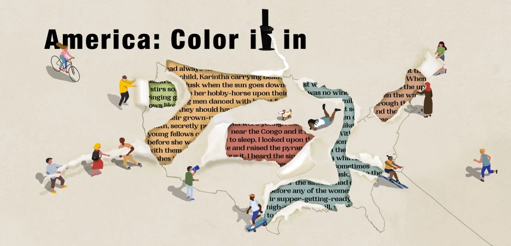
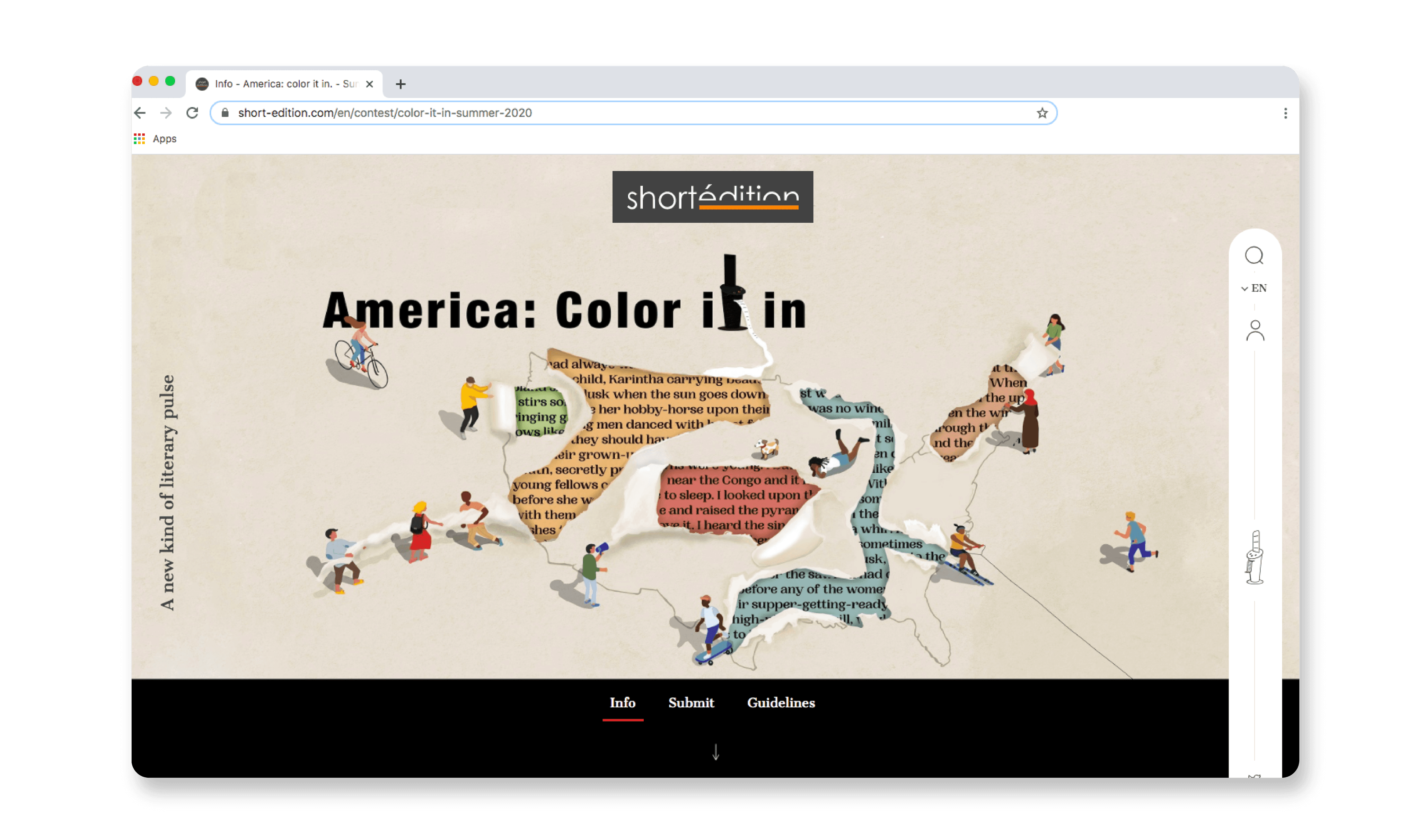
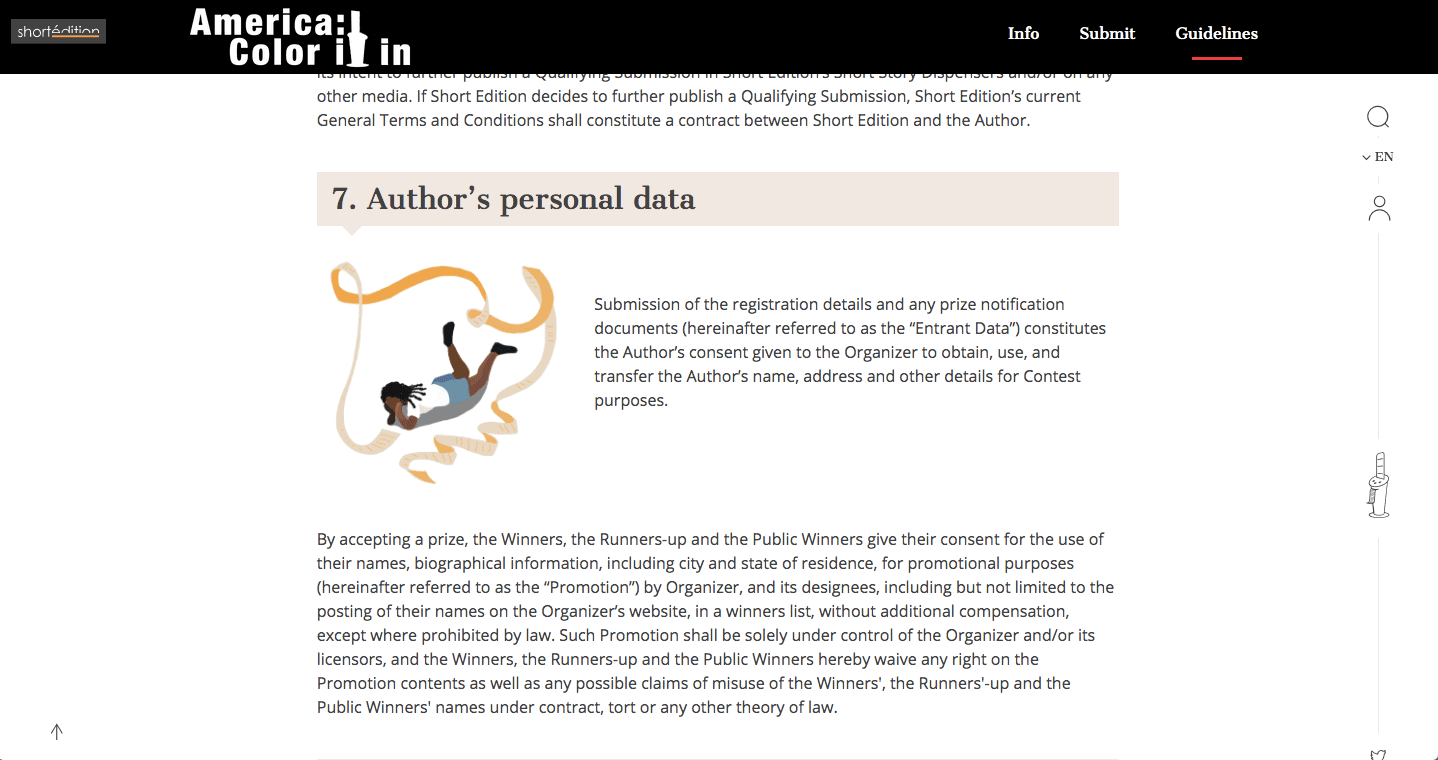
We chose a bold, vibrant color palette, with each color symbolizing different backgrounds, experiences, and perspectives across the U.S. The use of layered colors also represented the complexity of individual stories, inviting participants to "color in" their lives through personal narratives.

Let the colors in
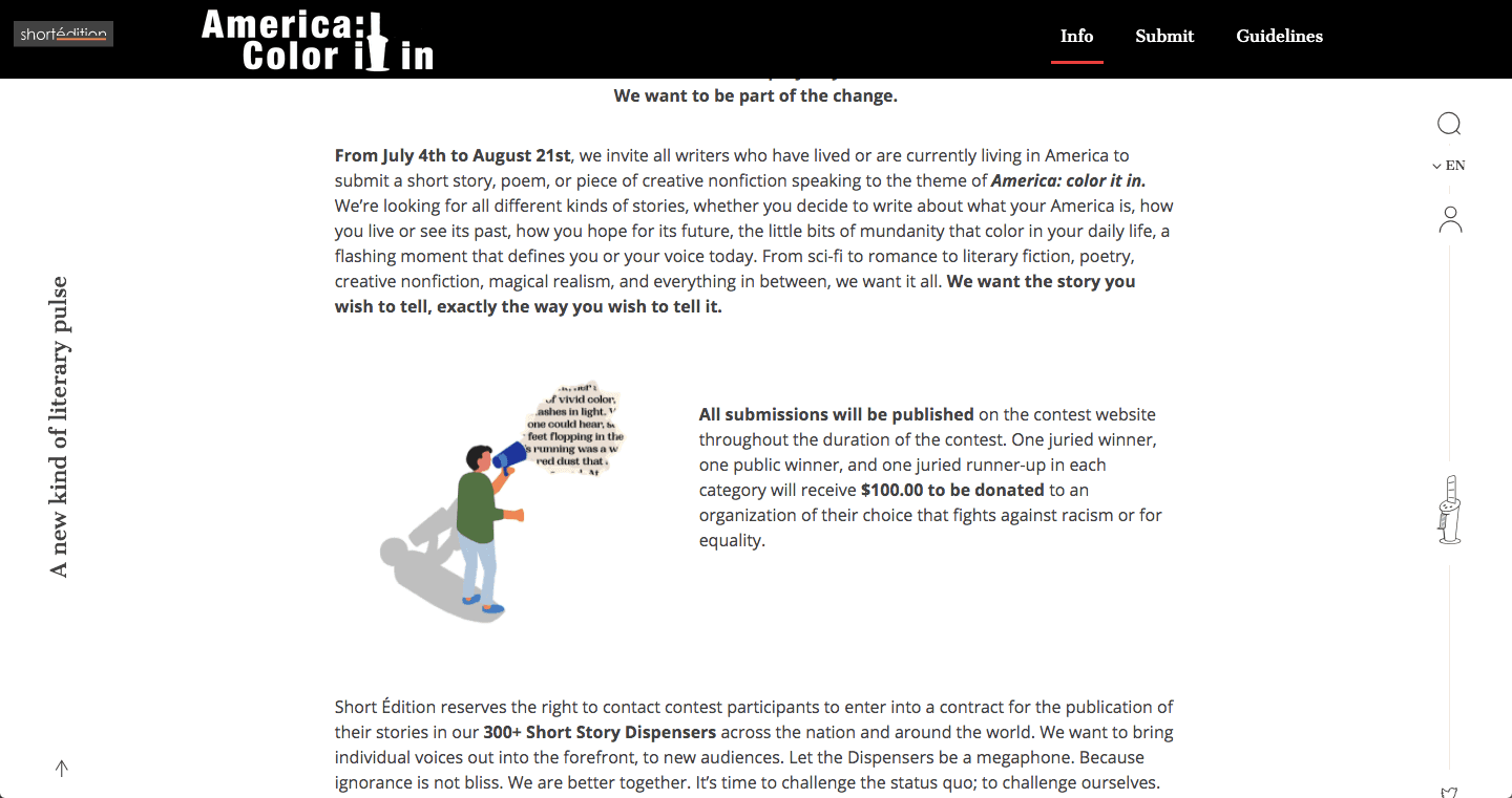
The illustration was built around the idea of layers
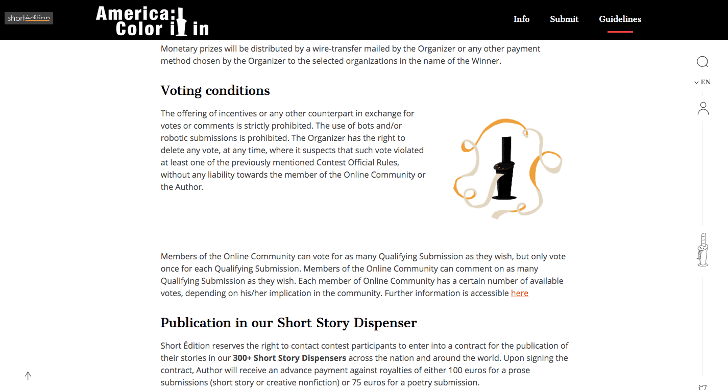
At the heart of the design was a silhouette of an anonymous figure symbolizing any American, filled in with various shades to reflect the contributions of diverse voices.
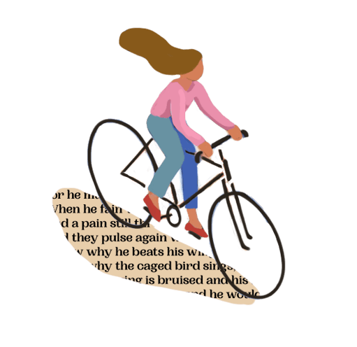
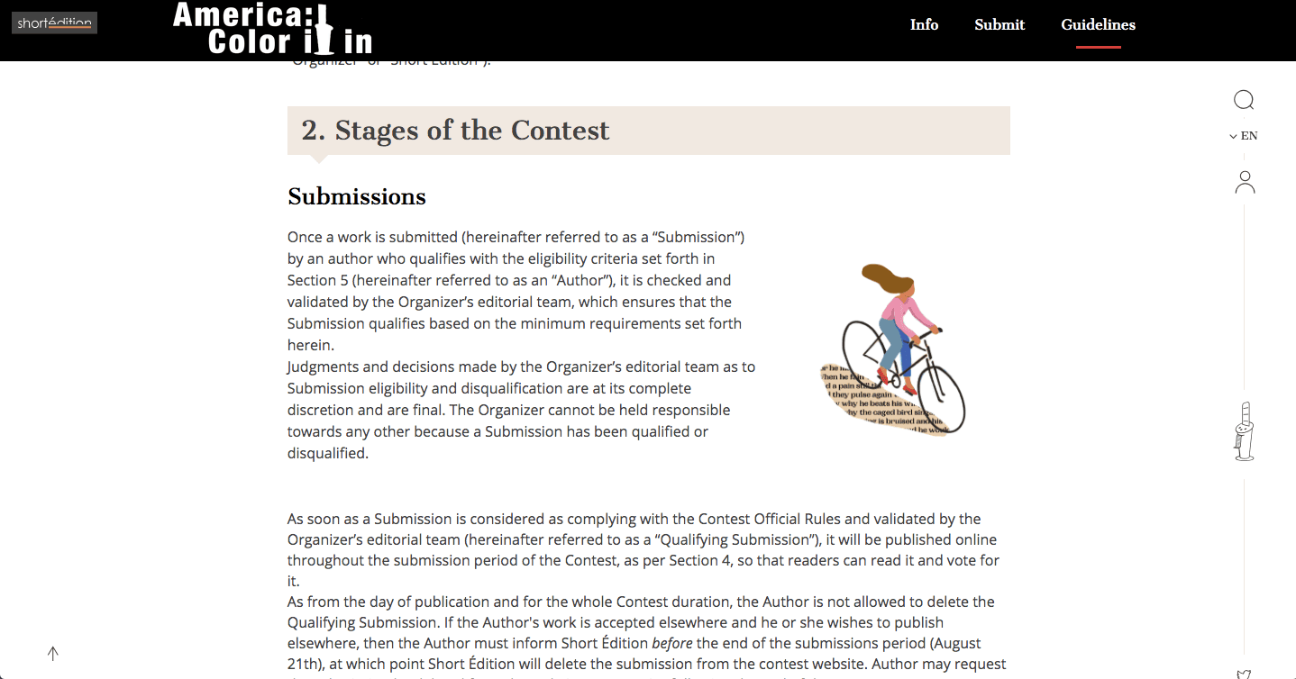
We incorporated subtle but deliberate references to key African American literary works like Jean Toomer’s Karintha and Langston Hughes’ The Negro Speaks of Rivers. These texts symbolized the often-overlooked voices in American history that had profoundly shaped its cultural narrative. These references were subtle, but for those familiar, they added depth to the contest’s message.
The clean, modern typography complemented the illustration without overpowering it. The title, "America: Color it In," featured bold text, while the silhouette of the dispenser served as the letter "t," enhancing brand familiarity.
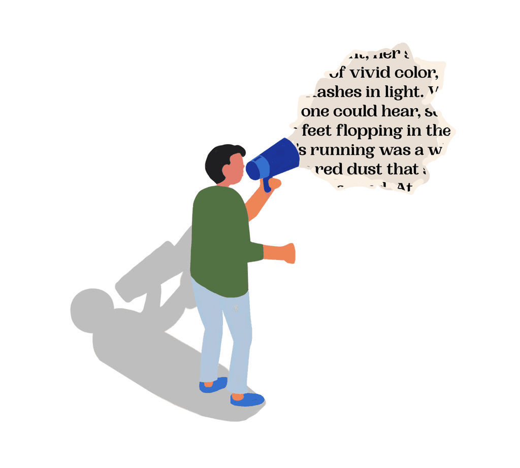
One challenge we faced was balancing artistic symbolism with clarity. We had to avoid the design becoming too abstract, so we made sure every visual element connected clearly with the theme.
The outcome
The final design hit the mark. It was vibrant, layered with meaning, and, most importantly, inviting. The visual captured the essence of the theme: inviting all Americans to "color in" their stories, to share experiences that might not have been heard before. It didn’t feel clichéd or overly patriotic, but instead felt fresh, modern, and relevant.
The contest launched on July 4th, right on schedule, and the response was exactly what Short Édition had hoped for. Writers from across the country submitted stories, poems, and creative non-fiction that reflected a wide range of experiences. From rural towns to urban centers, people shared their voices, and Short Édition’s short story dispensers printed them for readers in unexpected places across the U.S.
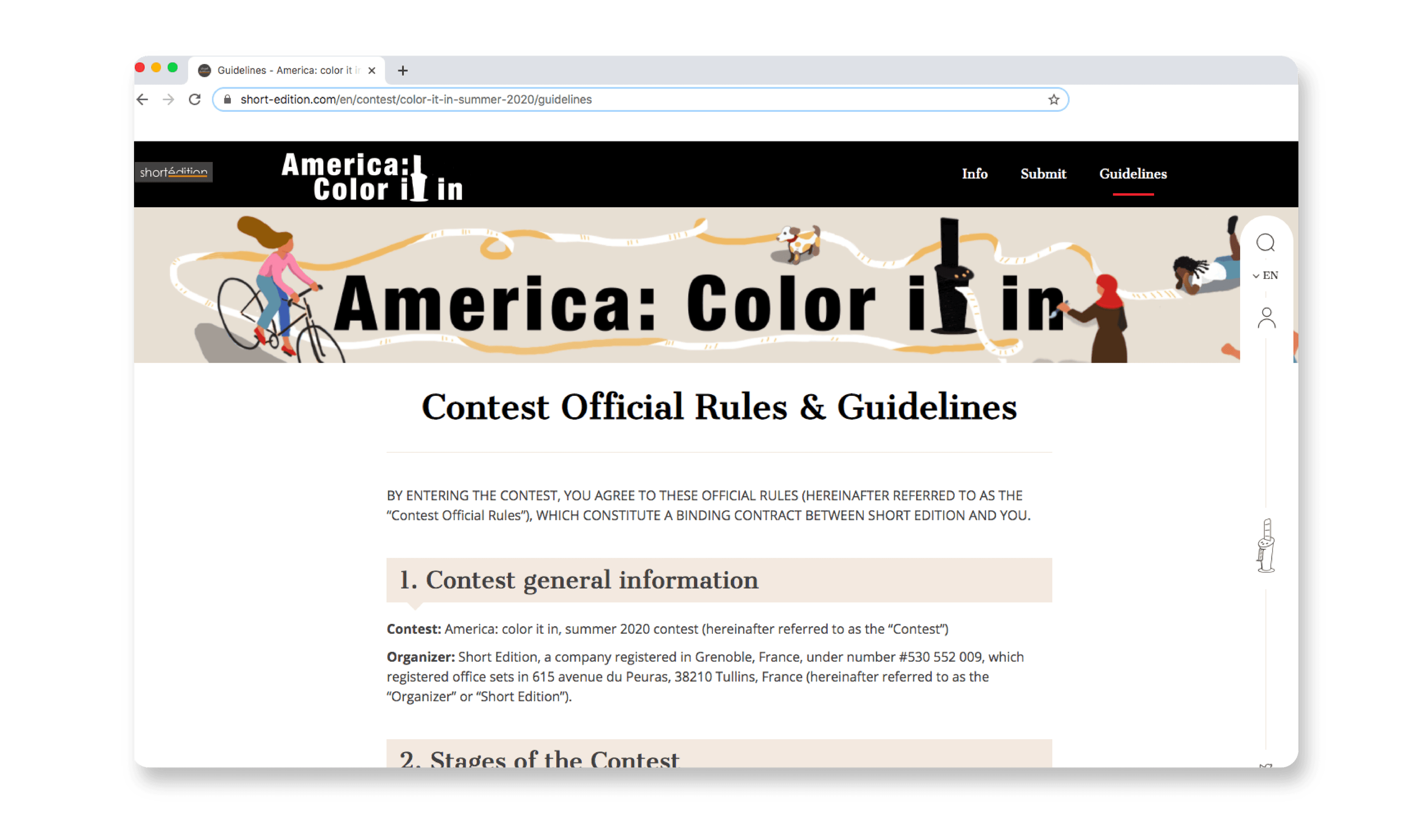
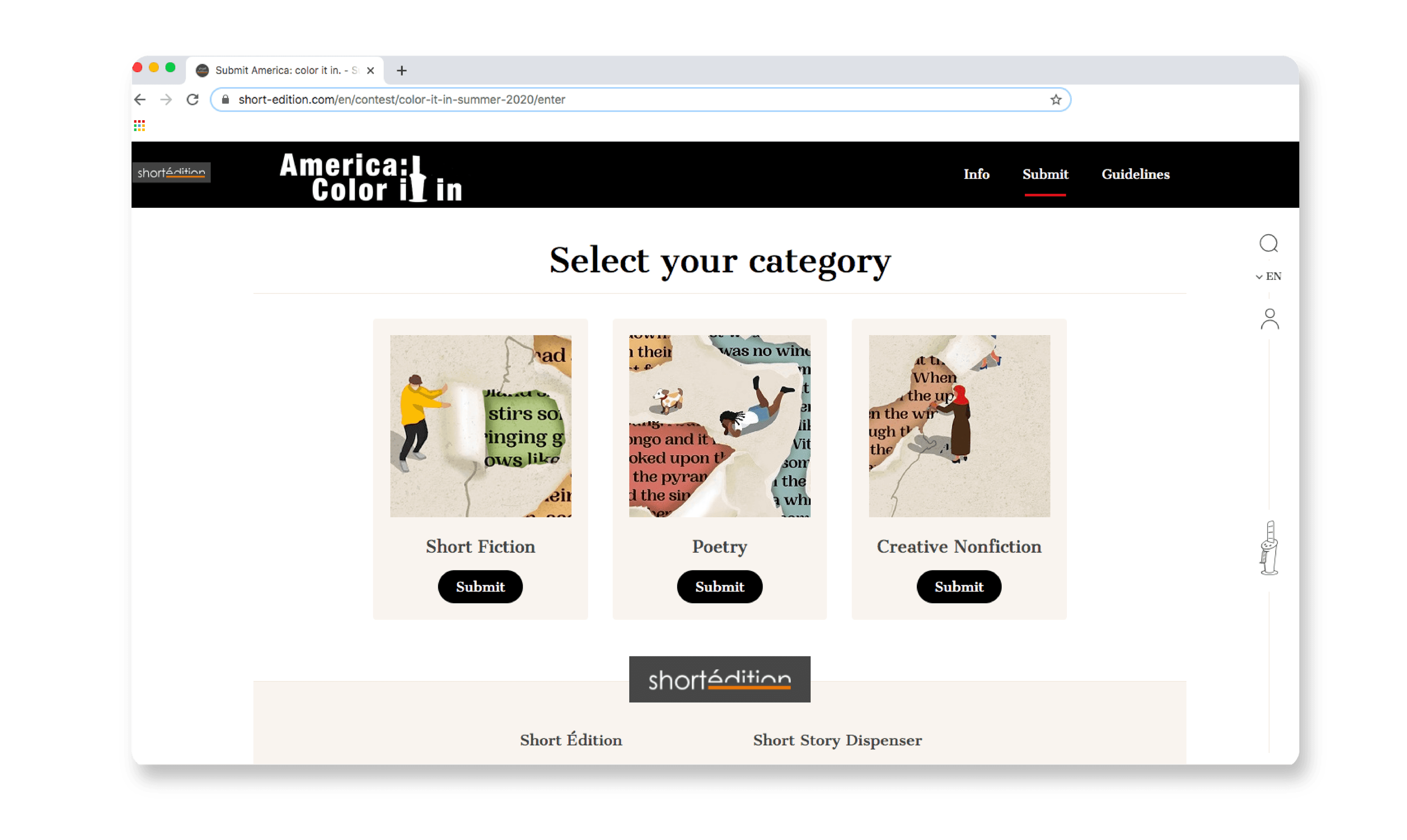
Here is how it appears in the digital world. 🌎
Thoughts
This project was a crash course in focused creativity under pressure. The tight deadline could have been stressful, but it forced us to get clear on the message quickly.
There wasn’t time to overthink, which was a blessing in disguise. It kept us from complicating the design and ensured we stuck to the core of what mattered.
In the end, it wasn’t just about creating a compelling visual. It was about giving people a space to be heard. Short Édition wanted to open doors for voices that matter, and I’m grateful to have helped make that happen.
📍 See if there's a Short Édition dispenser nearby, you might walk past one without knowing! Or share your writing with the community. Have fun!
