Digital Coverage Portal 🔒

Data isn’t just data anymore — it’s the difference between standing out and falling behind.


The Dynamic Coverage Portal is a TJP's proof-of-concept designed to reimagine how sales teams thrive in the Market Access space. In this project, I’ve focused on creating a tool that does more than look good — it transforms how sales reps operate. It’s a dynamic, AI-powered solution designed to do one thing: make the chaos of data not just manageable, but actionable.


In my role as a senior product designer, I was responsible for the entire design process, from initial user research, testing to final visual design.

🔒 Design display was limited due to project-specific privacy constraints.

Role:

Role:

Role:

Sr. Product Designer

Sr. Product Designer

Sr. Product Designer

Industry:

Industry:

Industry:

Healthcare

Healthcare

Healthcare

Environments:

Environments:

Environments:

Secured Portal Web

Secured Portal Web

Secured Portal Web

Tools:

Tools:

Figma, Microsoft Team, Jira

Figma, Microsoft Team, Jira

Year launch:

Year launch:

Sometime in the future

Tools:

Figma, Microsoft Team, Jira

Year launch:

2023

⟡ Highlight skillsets

Lean User Research 🔎

Lean User Research 🔎

Information Architecture 📏

Information Architecture 📏

Wireframing & Prototyping 🔗

Wireframing & Prototyping 🔗

Cross-functional collab 🤝

Cross-functional collab 🤝

01 - USER RESEARCH

The primary users of the portal are sales representatives, who currently struggle with inefficient and outdated tools.

The result? An inefficient process that’s costing them time and clarity.


The foundation of my design approach was built on a deep understanding of our users. I took the time to dive into their workflows, uncovering the pain points they faced with the legacy tool. Alongside this, I conducted a competitor analysis, pinpointing areas where we could truly stand out and deliver something better.

Pain Points

Fragmented Data Landscape

Fragmented Data Landscape

Fragmented Data Landscape

Data is scattered across various sources and formats, making it difficult to extract meaningful insights.

Data is scattered across various sources and formats, making it difficult to extract meaningful insights.

Inefficient 

Processes

Inefficient 

Processes

Impact on Health

Without thoughtful information structure, data processes all at once which leads to longer load times.

Without thoughtful information structure, data processes all at once which leads to longer load times.

Overwhelming Insights

Overwhelming Insights

Overwhelming Insights

Too much information presented to user at once causes cognitive overload.

Too much information presented to user at once causes cognitive overload.

Complex Decision-Making

Complex Decision-Making

Complex Decision-Making

Processing and digesting information takes up more time than the actual task.

Processing and digesting information takes up more time than the actual task.

02 - PERSONA

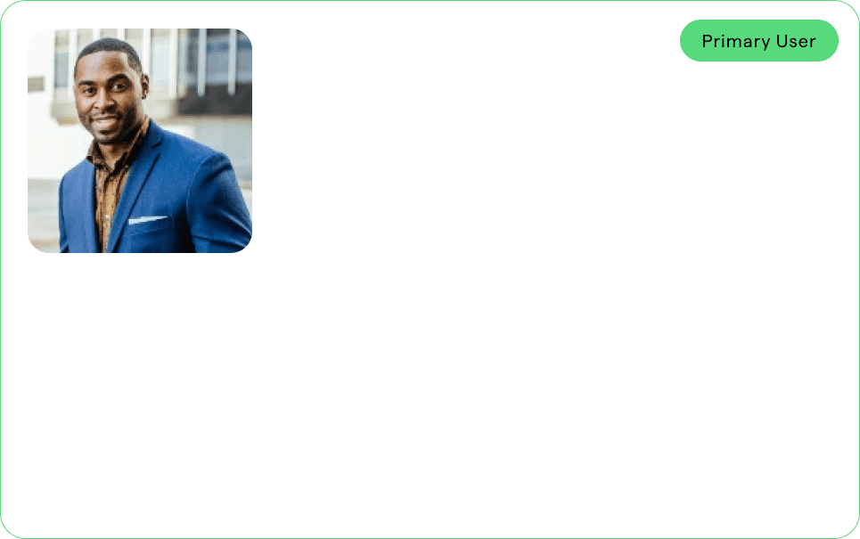
01 - On the ground

Problem statement:

Trey needs information that's organized and easily accessible on the go. He also requires guidance and tools to discuss market access with healthcare providers.


Goals:

Want to reduce time spent on crafting marketing materials and focus on productive meetings with HCPs or clients.
Providing doctors with confidence that patients will have coverage when they prescribe.


Frustration:

The complexity of the current UX/UI tool slows down his process of creating marketing documents with relevant messaging.

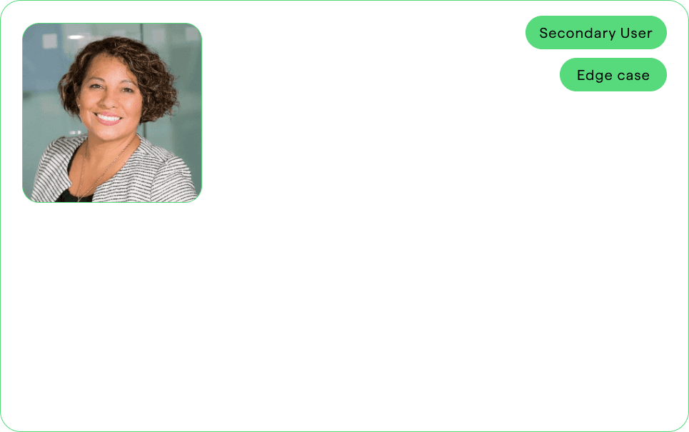
02- IN the office

Problem statement:

Sarah is a high performing manager who needs to efficiently create strategy plans for her sales team and get a high-level view of the market landscape to help set her team up for success.


Goals:

Have relevant insights at her fingertips and resources to help her communicate with her team.


Frustration:

The tool is complex but useful. She juggles her admin work with her team management which could get overwhelming. Wishes to get a pulse of the market while she’s doing other things.

03 - INFORMATION ARCHITECTURE

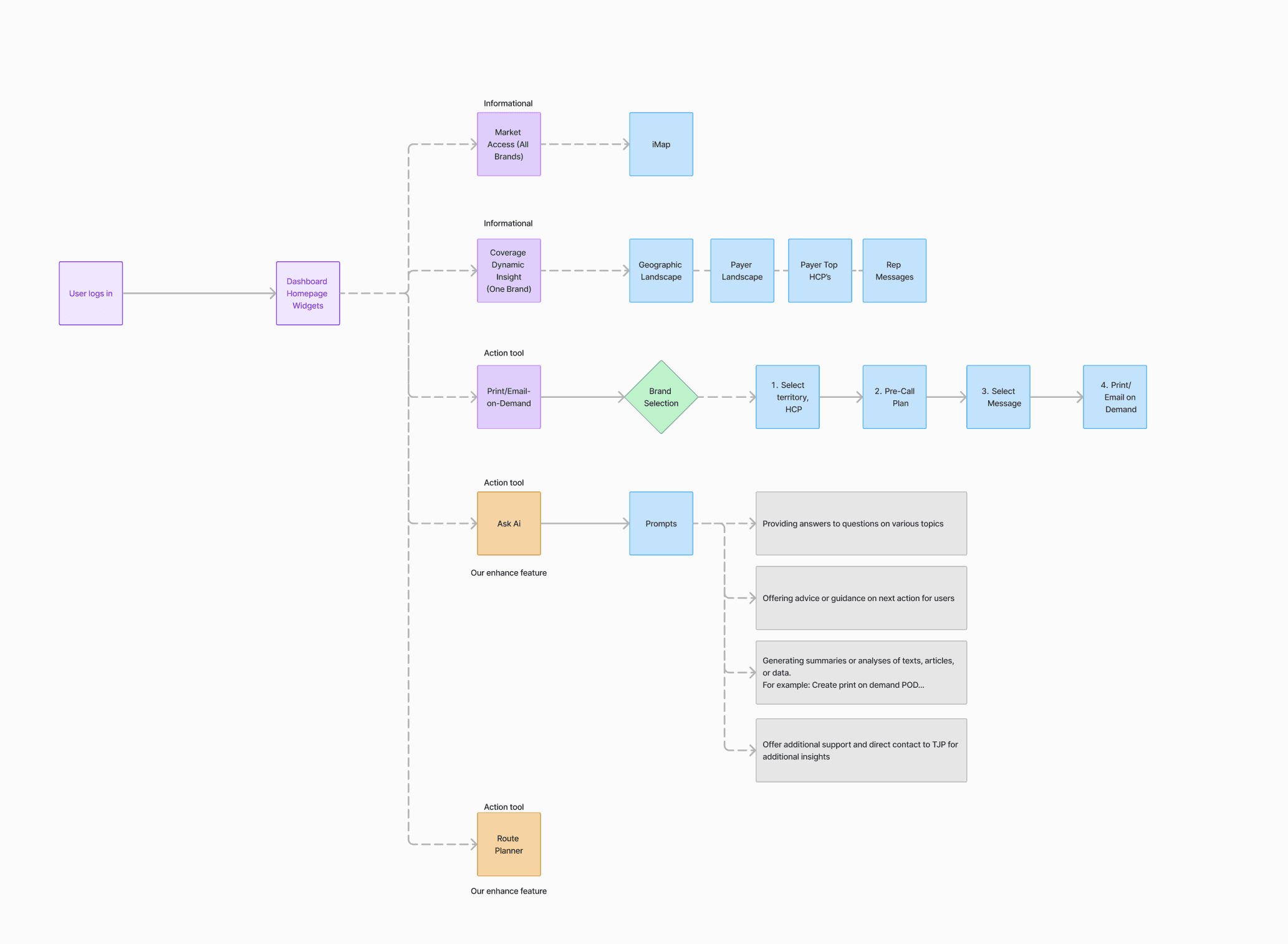
Once I had a solid understanding of user pain points, I mapped out the key user flows. These flows illustrated how users would interact with the portal to achieve their goals, such as generating reports or accessing payer data. My primary objective was to eliminate unnecessary steps and streamline these processes.
04 - PROPOSED SOLUTIONS

To address the challenges identified during the research phase, I designed a user-centered solution that transformed the fragmented and complex data landscape into an intuitive, streamlined experience for sales reps.

Streamlined Dashboard

Challenge: The old tool's dashboard overwhelmed users with data. It wasn’t clear what was most important or actionable.


Solution: I designed a modular, customizable dashboard where users could arrange widgets based on their preferences. Key data insights, such as market access changes and competitive intelligence, were given prominent positions.


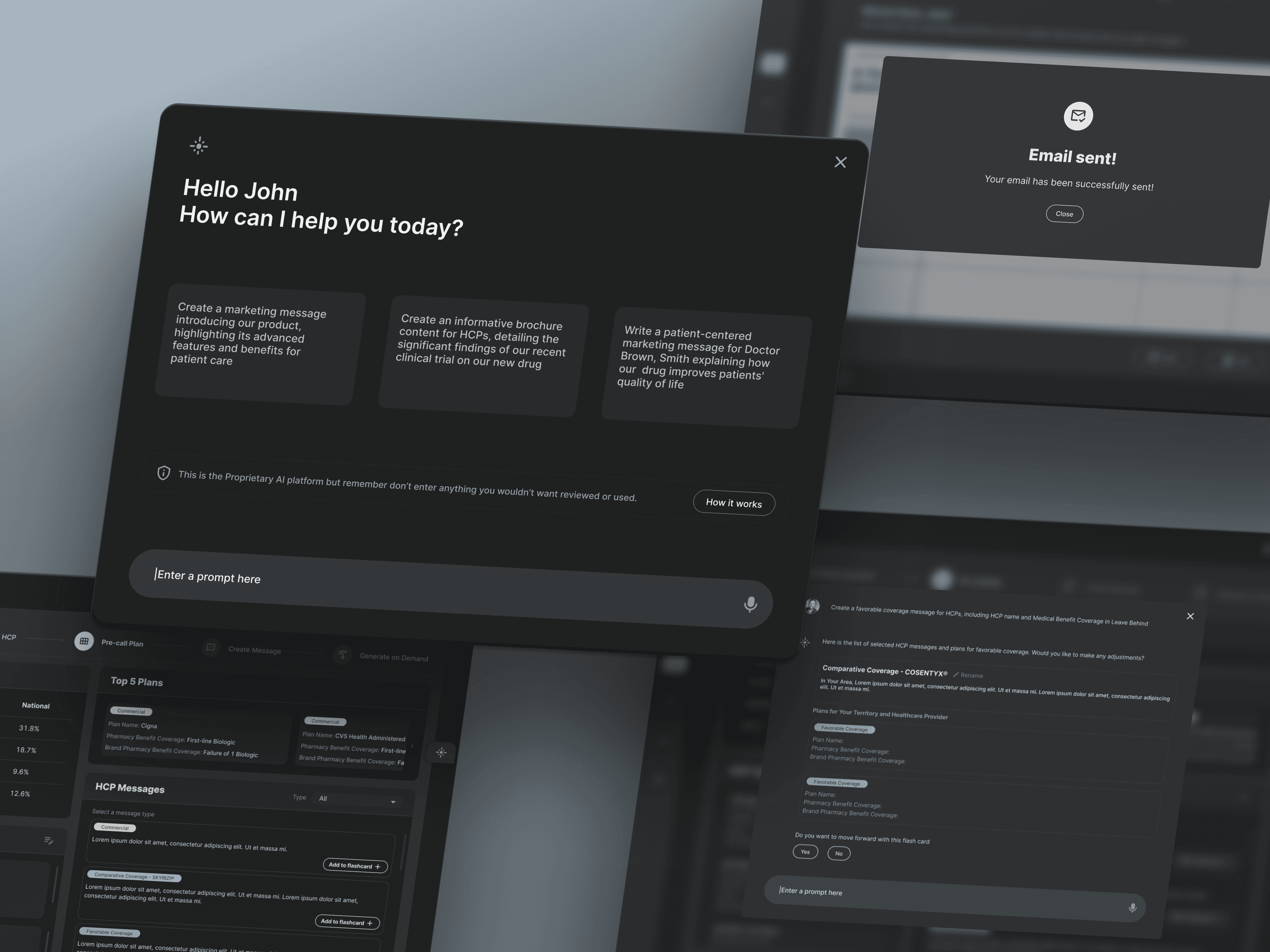
To help prioritize insights, I worked closely with the team to ensure AI-driven insights (e.g., "Payer X just increased coverage for Product Y") were automatically surfaced, so users didn't have to sift through raw data.

AI-Driven Insights

Challenge: Users struggled to extract meaningful insights from raw data. The cognitive load was too high.


Solution: My goal was to reduce this cognitive load by integrating AI. I designed a system where AI-driven suggestions were presented in easy-to-understand formats, providing contextual next steps such as, "Focus on Payer Z to capitalize on a new coverage opportunity." These insights were visually highlighted with clear call-to-action buttons.


I also designed an information hierarchy where critical insights appeared first, and users could drill down into details only if they needed more information.


Customizable Marketing Materials

Challenge: Sales reps were manually creating client-facing materials, a time-consuming task.


Solution: I introduced a report generation feature that allowed reps to quickly generate customizable, pre-approved materials. This involved building templates that sales reps could modify on the go, ensuring that the content remained compliant but flexible enough for different audiences.


In designing the interface for this feature, I focused on simplicity, with a drag-and-drop editor that allowed users to choose data points and visuals relevant to their specific pitch or presentation.


05 - DESIGN & TESTING

Here’s an inside look at my design process

Information Architecture and Content Strategy

User Flows & Wireframes

Visual Design

Prototype Testing

Takeaways and Next Steps

As a sr. product designer for the TJP Dynamic Coverage Portal, I’ve witnessed something powerful unfold: a shift from chaos to clarity.


By putting ourselves in the shoes of our sales reps, we’ve crafted a tool that doesn’t just present data—it tells a story.


This project has reminded me of a fundamental truth: great design isn’t just about aesthetics; it’s about empathy. It’s about understanding the people we serve and iterating until we get it right.


Note: While I am no longer a part of this project, I wish the team all the best as they continue to drive this initiative forward. Good luck, and keep pushing for excellence!

Need more detail?

Need more detail?

Need more detail?

While not all project specifics can be shared openly, I'm open to discussing further in private for any potential hiring or partnering opportunities.

Let's connect

Hạnh ơi

Hạnh ơi

Hạnh ơi

05 - DESIGN & TESTING

Here’s an inside look at my design process

User Flows & Wireframes

Prototype Testing

Visual Design

Information Architecture and Content Strategy

Takeaways and Next Steps

As a sr. product designer for the TJP Dynamic Coverage Portal, I’ve witnessed something powerful unfold: a shift from chaos to clarity.


By putting ourselves in the shoes of our sales reps, we’ve crafted a tool that doesn’t just present data—it tells a story.


This project has reminded me of a fundamental truth: great design isn’t just about aesthetics; it’s about empathy. It’s about understanding the people we serve and iterating until we get it right.


Note: While I am no longer a part of this project, I wish the team all the best as they continue to drive this initiative forward. Good luck, and keep pushing for excellence!