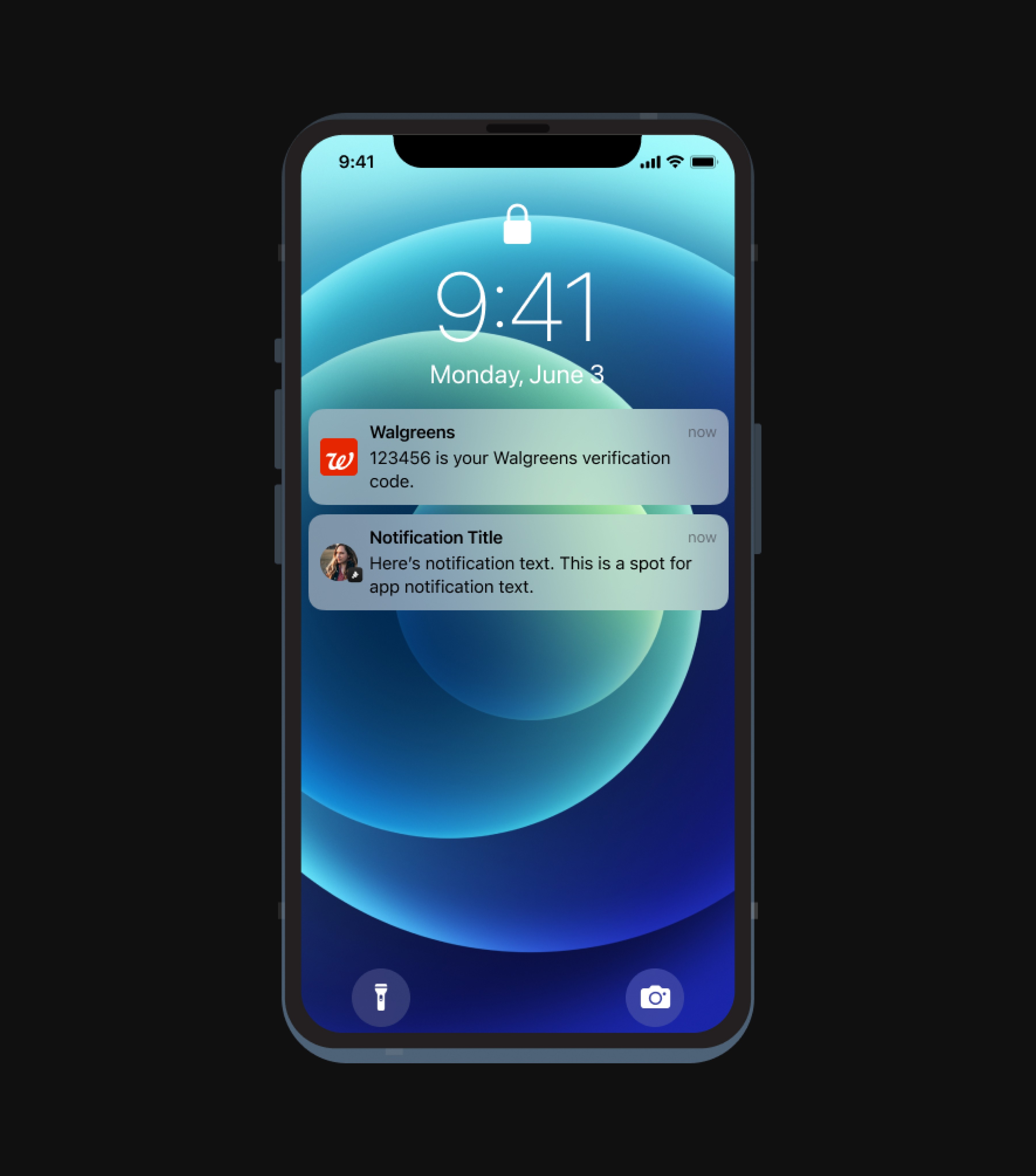
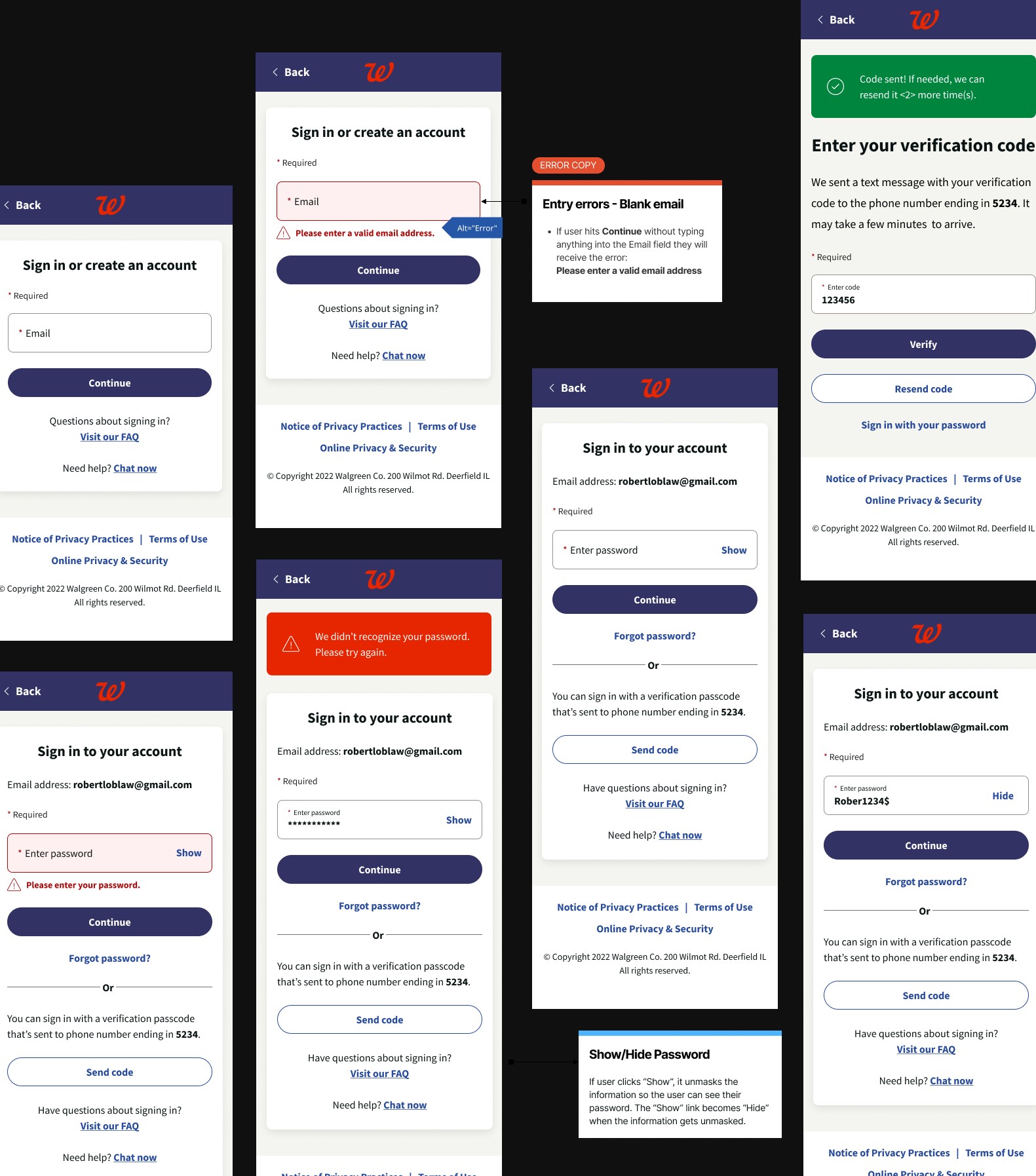
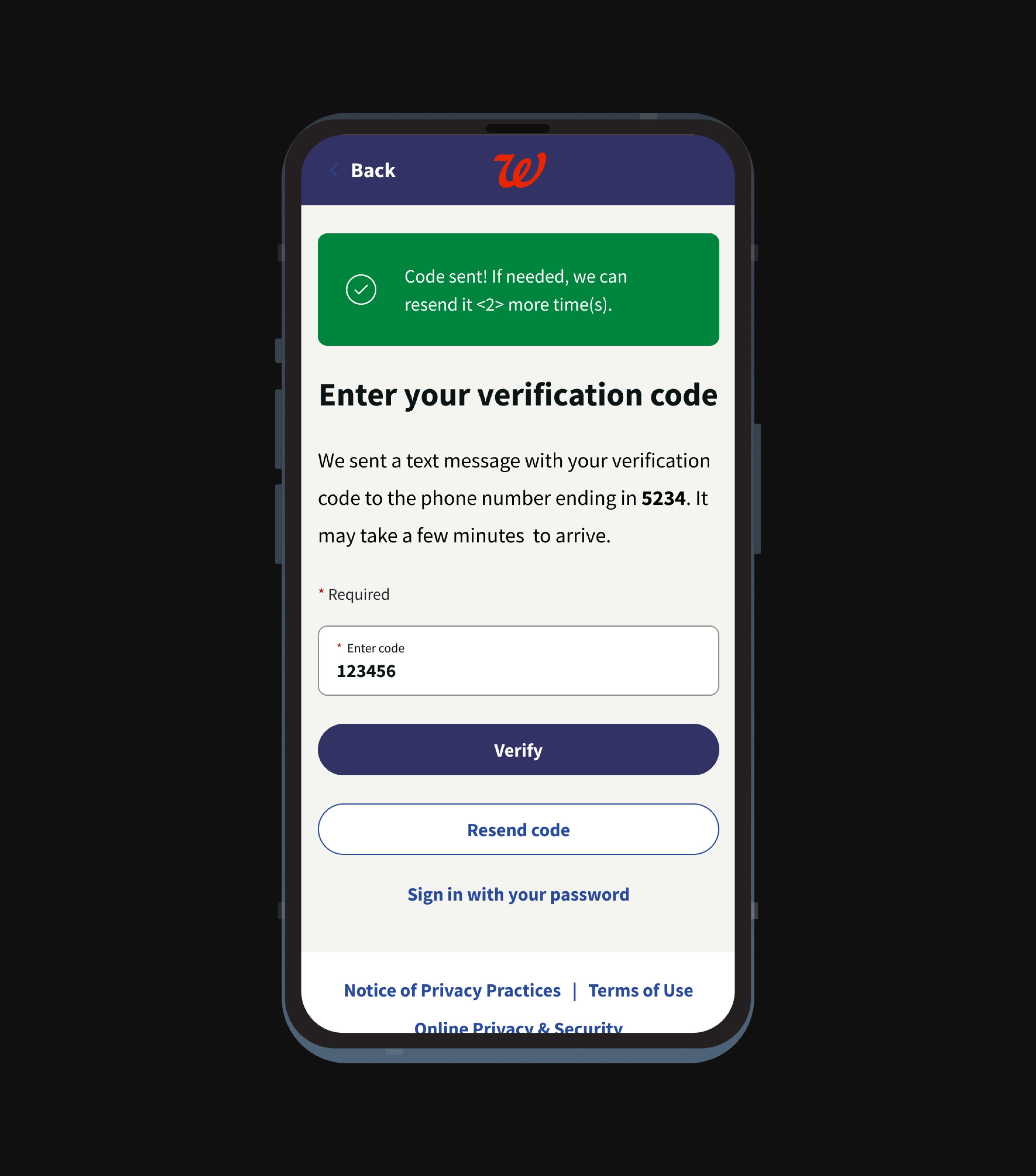
🔒 Design display was limited due to project-specific privacy constraints.
⟡ Highlight skillsets
Wireframing 🔗
Design System ⚙️
Cross-functional collab 🤝
Feature Challenge
Design and integrate the One-Time Passcode feature in a way that was seamless, efficient, and easy for users. The new security layer had to feel intuitive, fast, and non-intrusive while addressing the growing threats of unauthorized access.
My Challenge
When I joined the project, my talented teammate Lyann Pimentel, a lead UX designer, had already mapped out the user flow. She identified the need to balance tight security measures with ease of use.
My role was to build on this foundation by developing wireframes, applying the Walgreens Design System, and collaborating with the engineering team. Together, we assessed, evaluated, and integrated the OTP feature into the final product.
Strategic Approach: Applying the Lean UX Framework
We adopted the Lean UX Framework to guide our process, which emphasized rapid iteration, feedback loops, and user-centered thinking. The process was divided into three core steps: Think, Make, and Check.
01 - THINK
Understanding the Problem & Aligning with Business Goals
This phase focused on laying the groundwork and aligning the security requirements with user experience goals.
Security vs. Usability Trade-Off was our primary obstacle in this phase. Too much security could frustrate users, while too much leniency could compromise safety. With that, we collaborated closely with stakeholders, particularly the Product Owner and UX Manager, to refine the user flow, minimizing friction while maintaining security.
02 - MAKE
Prototyping and Iterating on Solutions
Once the user flow was defined, I focused on developing wireframes and prototyping the OTP feature. My responsibility was to ensure that the wireframes adhered to the Walgreens Design System. I built prototypes in Figma and conducted cross-platform usability testing, leading to adjustments that made the OTP process smooth on both mobile and desktop.
I had to ensure the designs were technically doable, especially with new security features needing backend support. I worked closely with our cross-functional team to keep refining the wireframes to meet technical needs, and we stayed in sync using Microsoft Teams for quick problem-solving.
03 - CHECK
Validating the Solution and Delivering to Engineering
In the Check phase, we conducted thorough testing and collaborated closely with the engineering team to ensure a smooth handoff and implementation of the final design.
Translating complex wireframes into actionable specs for the engineering team was tricky, especially since the OTP feature affected multiple system areas. To address this, we provided detailed wireframes, design assets, and thorough documentation, and held multiple design reviews with the engineering team to ensure everything was clear.
Estimated Results
99.8% increase in account security, effectively reducing the risk of unauthorized access across all devices.
88% of users signed in, showing enhanced trust and engagement with Walgreens’ platform.
70% reduction in vendor management costs, highlighting the efficiency of leveraging the Walgreens Design System and internal resources.
Wrapping Up
The Lean UX Framework was our secret weapon for quickly delivering a secure and easy-to-use solution.
My part? Transforming the user flow into practical wireframes, applying Walgreens' Design System, and teaming up with engineers for a smooth OTP feature rollout. Focusing on both user needs and tech feasibility, we nailed a solution that boosted security without skimping on user experience.
Fast-forward to today, and I've checked in on the OTP feature, spotting some sweet updates and upgrades. It's clear that Walgreens is still all about keeping users secure and happy.
I'm stoked to see a bunch of user flows I worked on still doing their thing, with other parts getting a makeover for an even better UX.
I'm pumped to bring these lessons and experiences to future projects, always keeping user-centered solutions at the top of my list for both businesses and their users.
While not all project specifics can be shared openly, I'm open to discussing further in private for any potential hiring or partnering opportunities.
Let's connect
Or keep going


