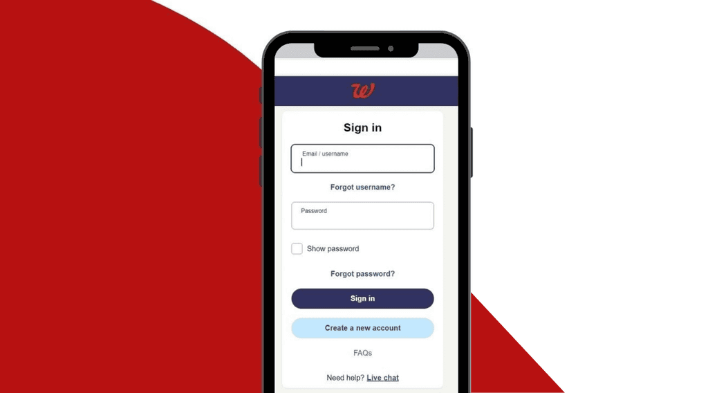
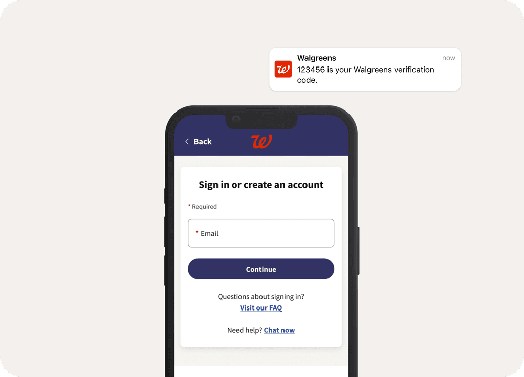
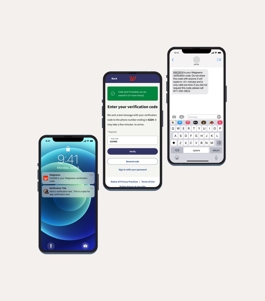
To give Walgreens users peace of mind, our product team designed a One-Time Passcode (OTP) feature that keeps accounts secure without getting in the way of the user experience.
As part of the in-house UI/UX team, my role was to enhance the existing login process. Our team aimed to integrate a secure OTP system that didn’t require users to remember passwords, while keeping the experience simple, fast, and non-intrusive.
Team
Role: Lead UI Designer
Collaborators: Lead UX Design, Product Owner, UX Manager, Engineering Team
Tools: Figma, Microsoft Teams, Jira
⟡ Highlight skillsets:
User Flows 👤
Wireframes 🔗
Design System ⚙️
Cross-Functional Collaboration 🤝
Approach
We leaned on the Lean UX Framework (pun intended) to stay agile and user-centered. Three steps: Think (understand the problem), Make (build quickly, test constantly), and Check (validate and refine). This approach let us deliver value fast, without losing sight of the user’s needs.
Feature Challenge
Design Process
01 - Think
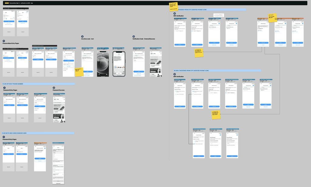
Our UX Lead, Lyann Pimentel, mapped the initial UX flow, establishing a secure yet user-friendly foundation. My role was to support and collaborate closely with her and stakeholders, refining the flow to balance security with ease.
02 - Make
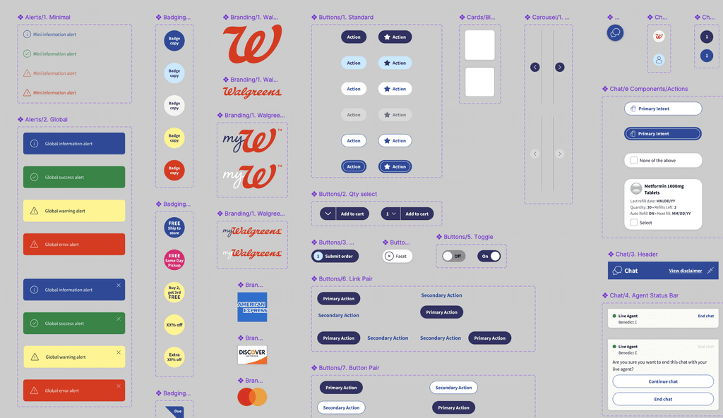
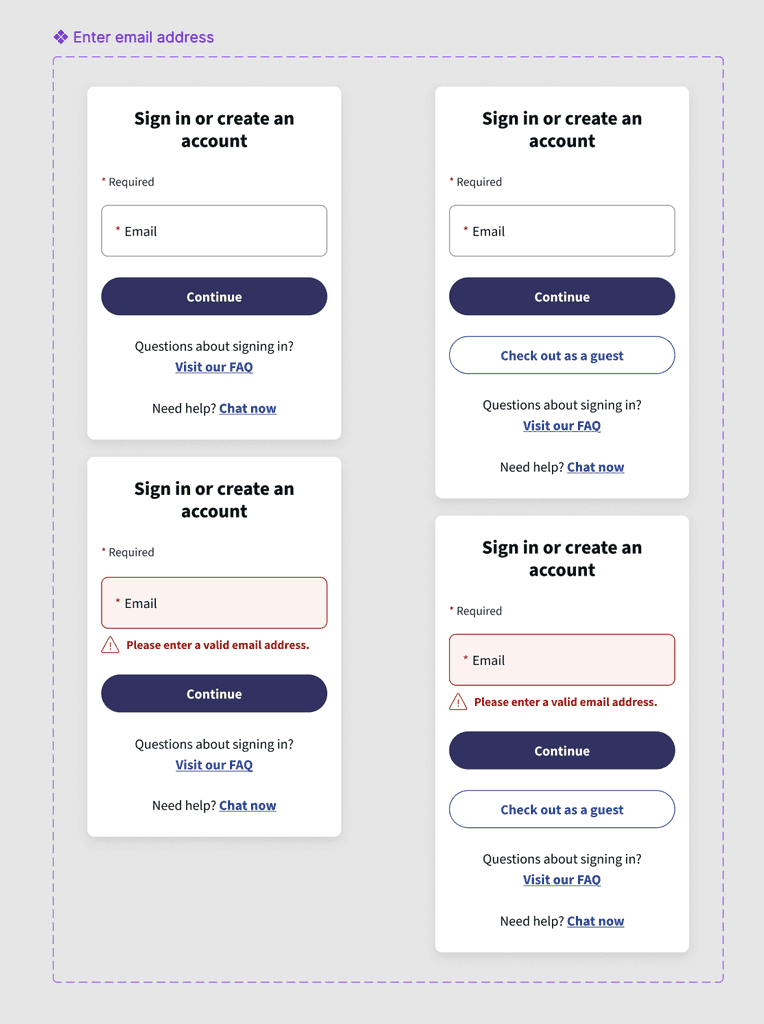
I dove deep into Walgreens' Design System, making sure every single detail aligned perfectly with their brand standards and met what users expect. No shortcuts, no deviations—just a relentless focus on delivering something that feels unmistakably “Walgreens.”
Screenshot of a portion of the Walgreens Design System (Web)
↳ Copy Compliance and Accessibility
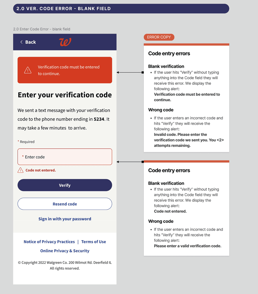
I worked with the UX writer to ensure all copy was compliant, accessible, and aligned with Walgreens’ tone, enhancing usability and inclusivity.
↳ UX Flow Accuracy
Working side-by-side with the UX Lead, I took the initial wireframes and transformed them into final, polished designs; never losing sight of the original flow or design intent.
It’s about respecting the vision while refining the details, making sure that every step feels right for the user.
↳ Mobile-Friendly Design
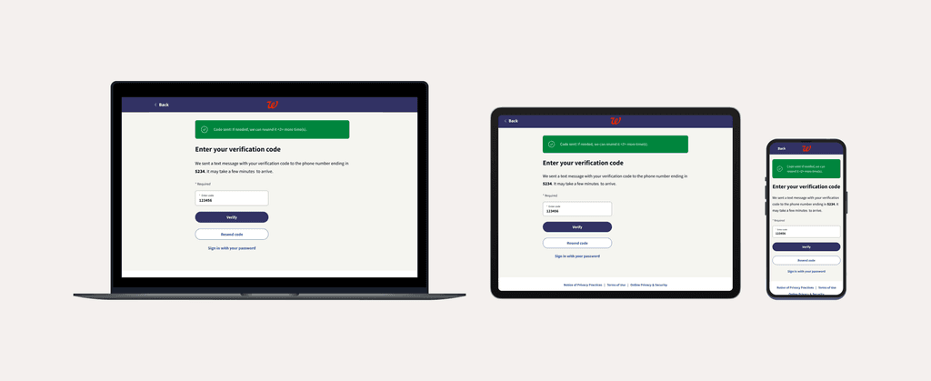
I created mobile-first layouts that do more than just resize—they’re built to enhance accessibility and ensure a seamless experience on any device.
It’s about meeting users where they are and making it easy for them to connect, no matter how they show up.
03 - Check
This was the final stretch: making sure the design delivered perfectly across every screen size, from mobile to desktop. We tested every detail for responsiveness, refining it for a seamless experience on any device. I worked closely with engineering, handing over precise specs and detailed documentation, and ran design reviews to guarantee a smooth, spot-on implementation.
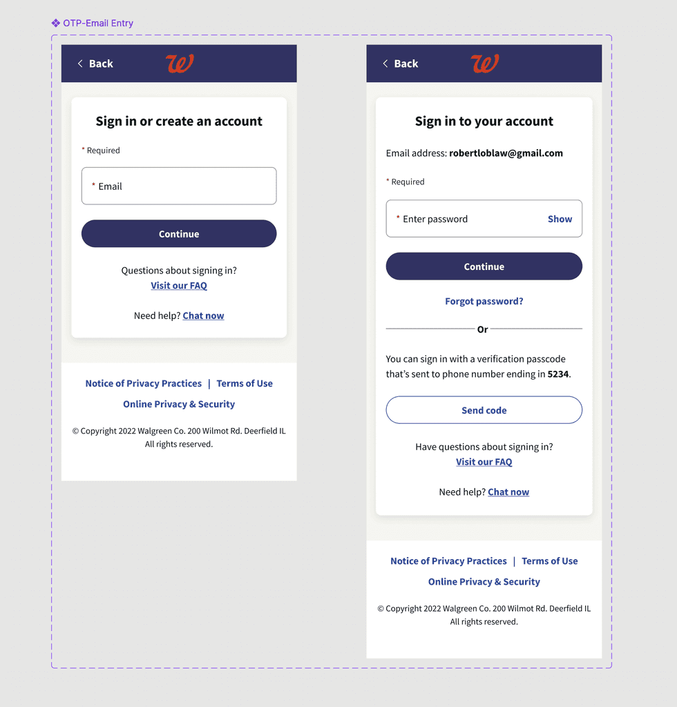
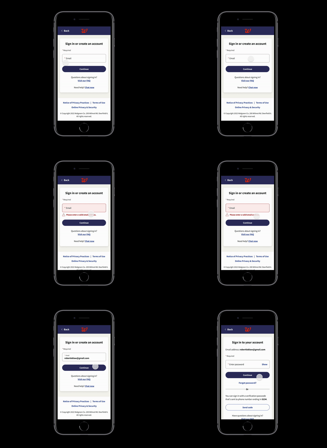
Verification via SMS User Flow - OTP
(Phone Number on file)
Users use OTP (Happy Path)
Users use OTP (Unhappy Path)
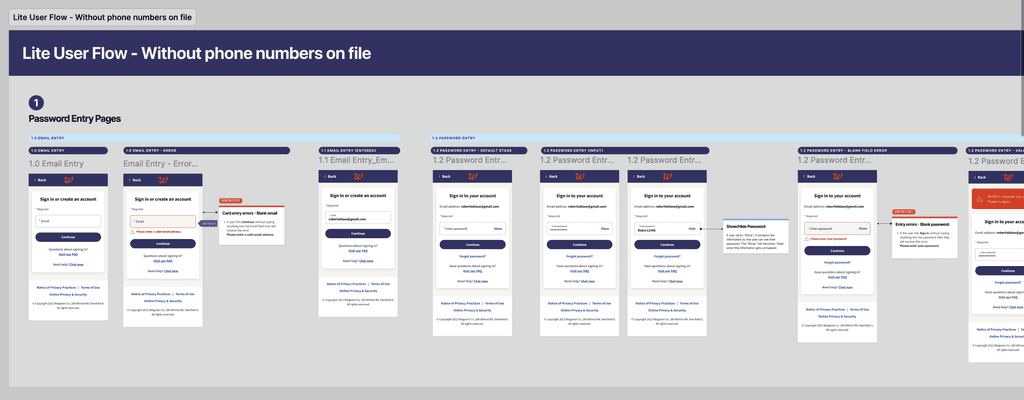
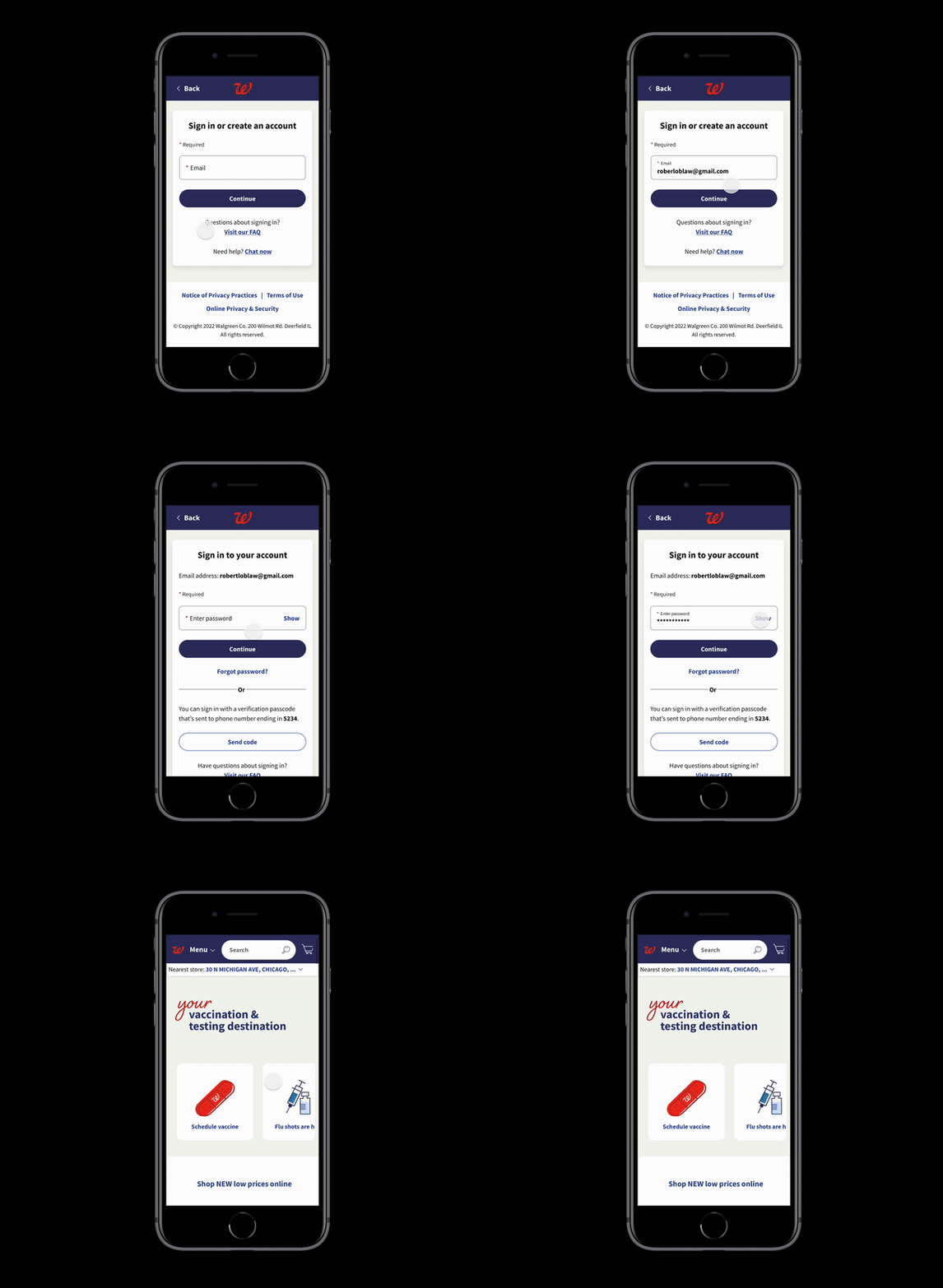
We also designed an alternative user flow that doesn't rely on OTP to create a seamless and consistent experience.
Current user login using password.
( Phone Number on file)
Users input password (Happy Path)
Users input password (Unhappy Path)
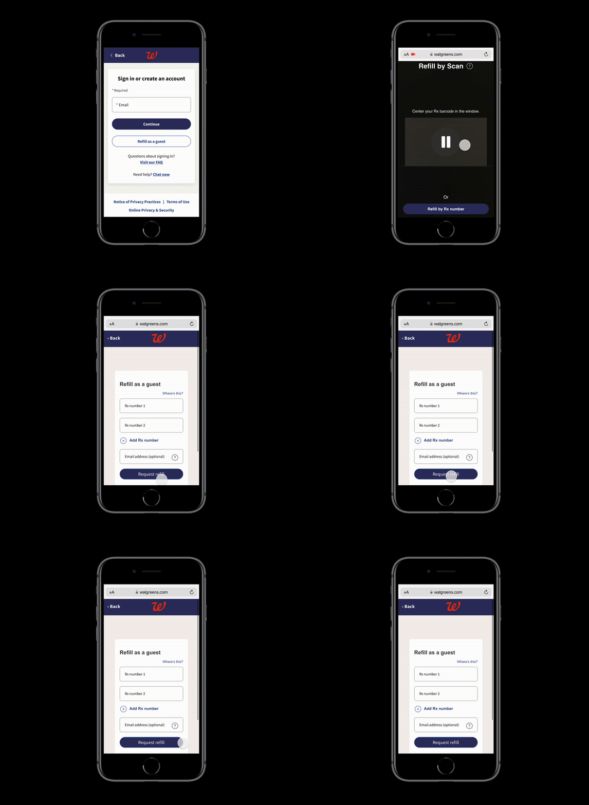
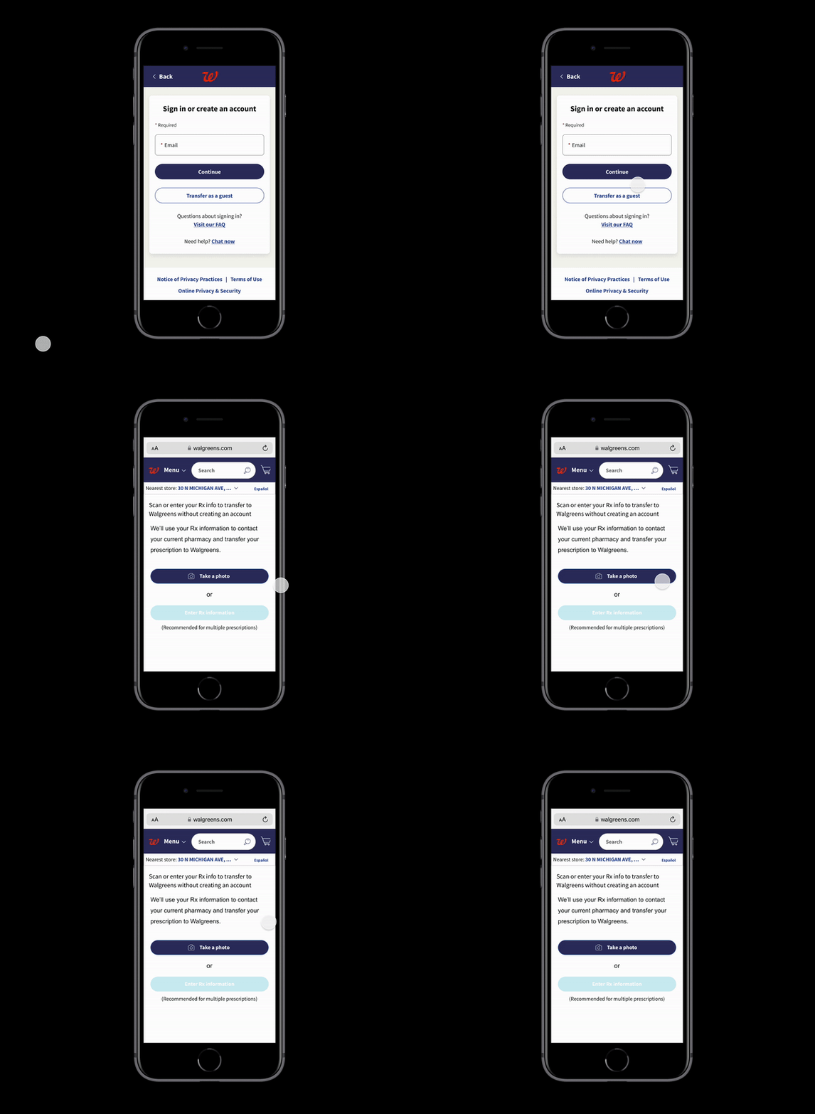
Guest Flow
Refill Rx
Transfer Rx
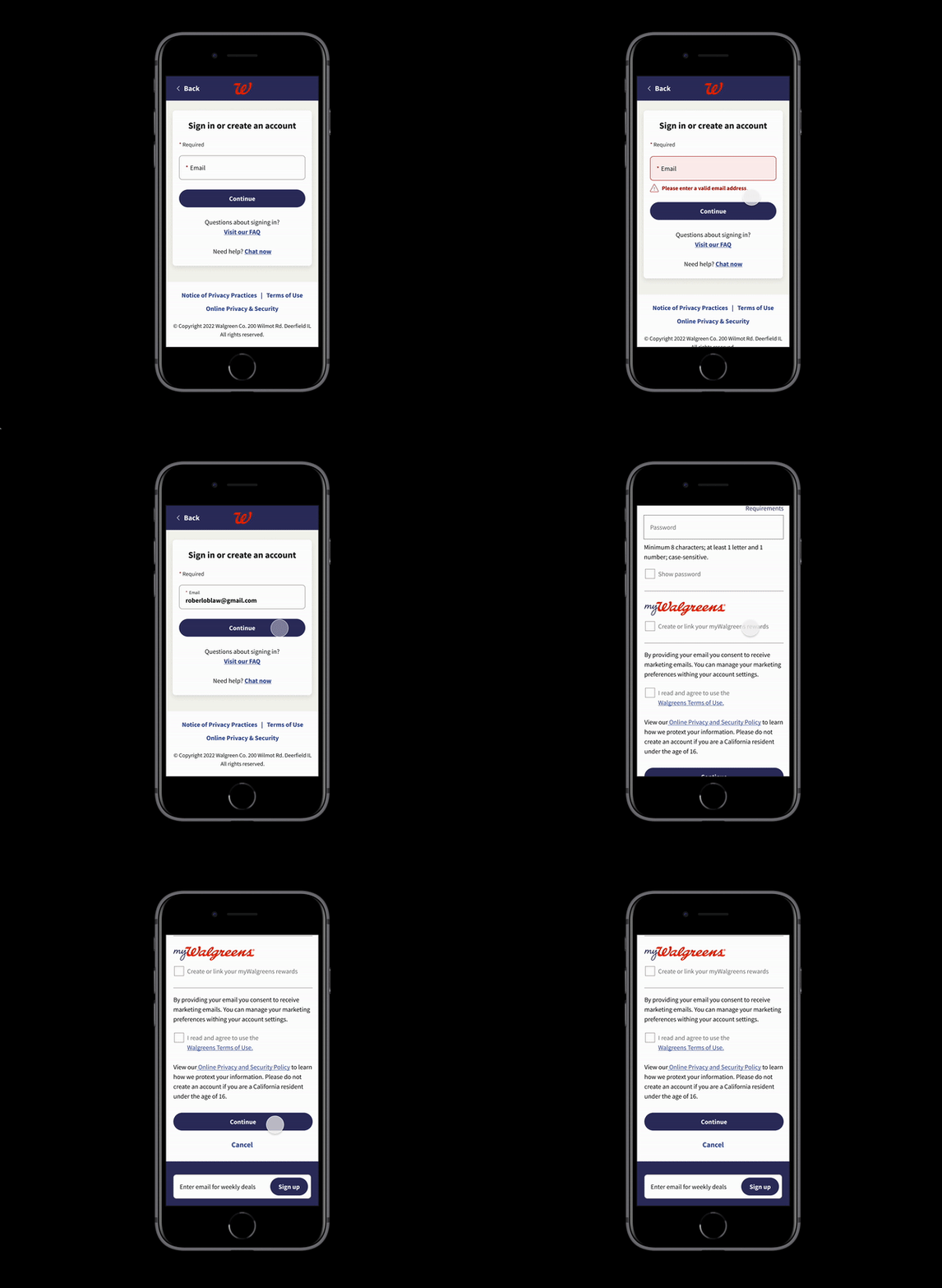
New user
(NO Phone Number on file)
New user will be directed to "create an account" flow

Early tests showed OTP cut unauthorized access risks across devices.

Showing enhanced trust and engagement with Walgreens’ platform.

Showcasing the efficiency of Walgreens' Design System and internal resources.
Wrapping Up
The Lean UX Framework was our key to swiftly delivering a secure, user-friendly OTP solution.
My role? Turning the user flow into actionable wireframes, applying Walgreens' Design System, and collaborating with engineers for a seamless rollout. We prioritized security and user experience equally, creating a system that worked effortlessly for users.
Today, I see the OTP feature evolving with new updates, reaffirming Walgreens' commitment to user security and satisfaction. I’m excited to bring these insights into future projects, always keeping user-centered solutions front and center.
