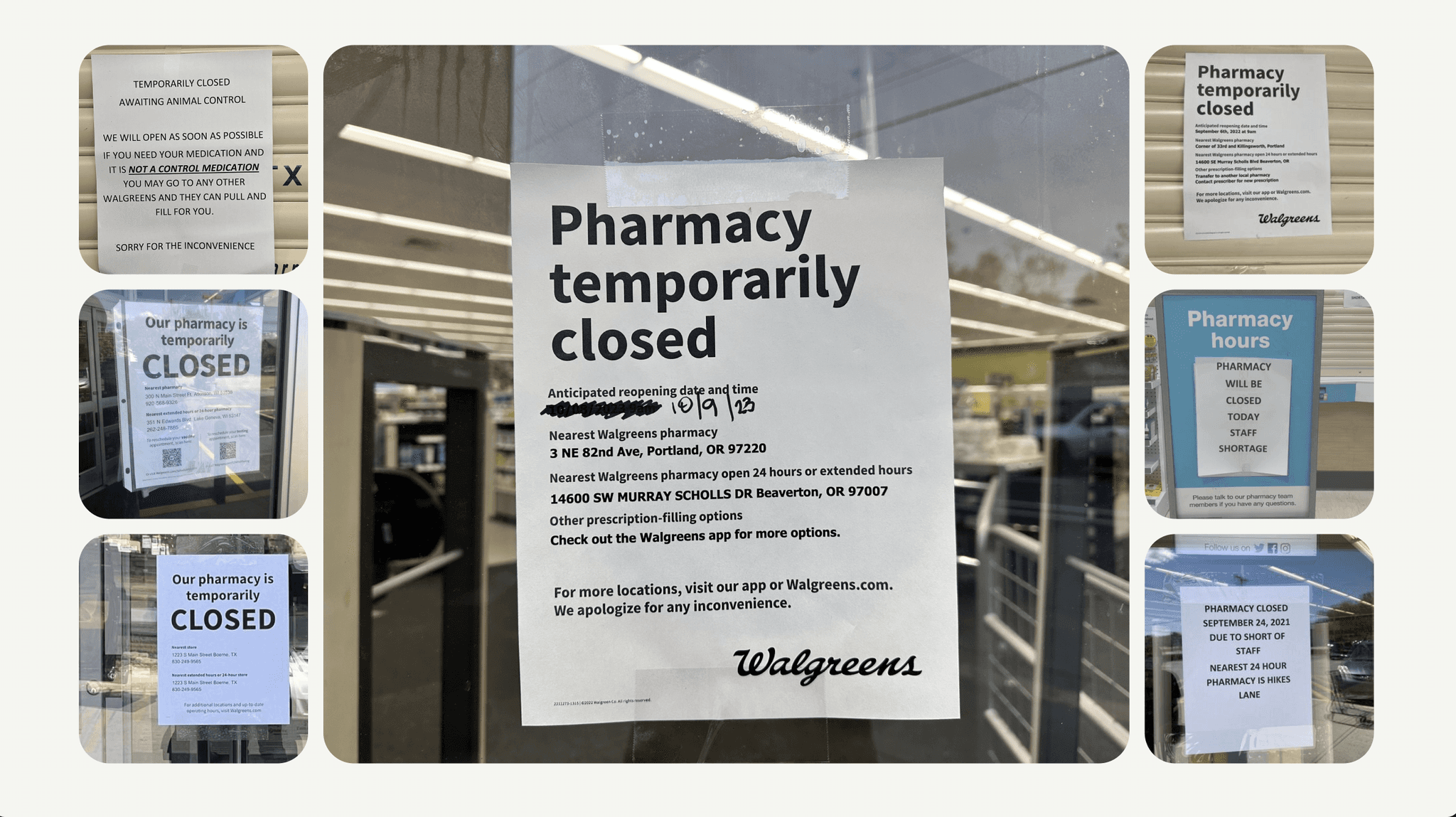
When pharmacy hours don’t match what customers see online, trust breaks. For Walgreens, this wasn’t just a technical glitch but a chance to lead with clarity and care.
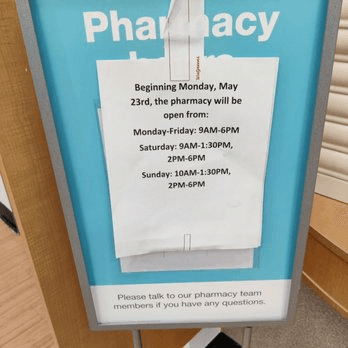
Reduced Pharmacy Hours were creating chaos: app updates lagged 24 hours behind, leaving customers misinformed and frustrated. This wasn’t just about inconvenience; it was about missed medications and real health risks.
⟡ Highlight skillsets:
UX Research & Testing 🔎
Wireframes 🔗
Design System ⚙️
Cross-Functional Collaboration 🤝
Team
Role: Lead UX/UI Designer on the Future of Communication Team
Collaborators:
Design Manager: Akemi Hong (shoutout for her invaluable guidance 🙌)
BAS Team: Integration heroes, ensuring real-time updates synced seamlessly
Cross-functional Partners: Bridging silos across web, app, SMS, and emailLead UX Design, Product Owner, UX Manager, Engineering Team
Tools: Figma, Microsoft Teams, Jira
Challenge
Problem Solving
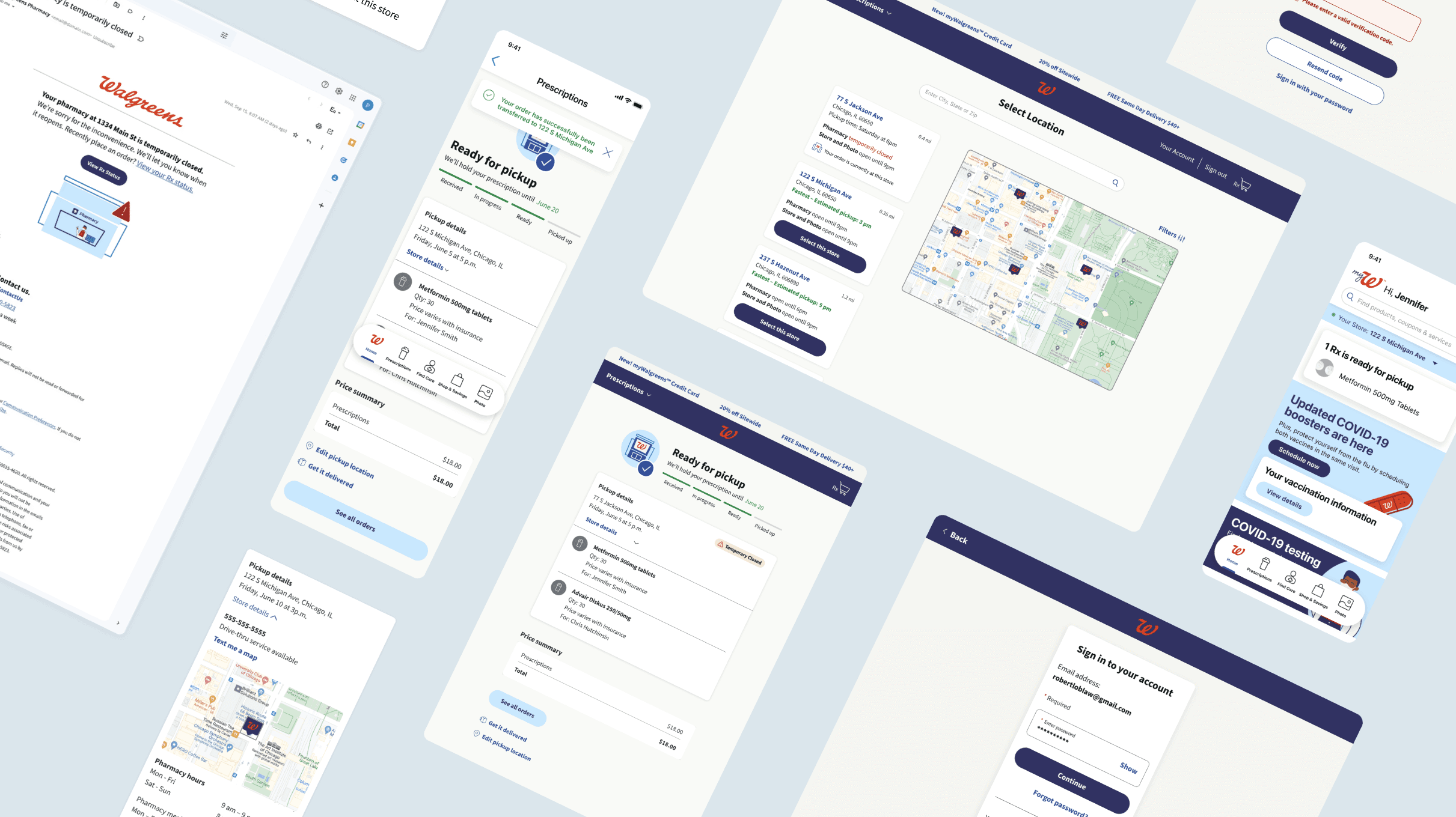
I designed a system that prioritized real-time alerts and cross-channel consistency:


By collaborating closely with cross-functional teams, we solved the technical challenges that come with real-time updates, integrating them smoothly into existing systems, so users could trust the information they received without delay.

Results & Impact
This approach is projected to:
Increase customer satisfaction by 10-15%, reducing frustration from mismatched hours.
Reduce missed prescription pickups by 20-30% through real-time updates and alternative options.
Boost digital engagement by 5-10% as customers rely on accurate store hours.
Improve operational efficiency by 15-20%, reducing manual customer service interventions
Increase pharmacy retention by 5-7%, keeping more customers within the Walgreens system.
Next Steps
These results are only the start. If you’d like to explore how we tackled the design process, overcame technical challenges, and made key decisions to achieve these outcomes, schedule a meeting for an in-depth look.


